
TL;DR
- The core decision: whether you're building to display what's available or to answer a question somebody asked.
- When doing nothing is right: when the questions arrive rarely enough that answering them by hand costs less than maintaining a view.
- What has to be true: the definitions behind the numbers are written down and somebody agreed them.
- How the options split: by audience, because a view built for everybody is built for nobody.
- Decision rule: if two people can produce different numbers and both defend them, fix the definition before the dashboard.
- Outcome to expect: fewer numbers, more trusted, and meetings that argue about decisions rather than arithmetic.
The Meeting That Became About the Numbers
A leadership meeting is looking at headcount. HR brought a figure. Finance brought a different one. The gap is small and nobody can explain it in the room.
What happens next is predictable. The agenda item about what to do becomes an item about which number is right, somebody promises to reconcile it offline, and the actual decision is deferred. Twenty minutes gone, no conclusion, and a follow-up that will conclude that both numbers were correct for different definitions.
Then it happens again the following month, because nothing structural changed.
Best tools for HRIS Software
This is the failure mode that dashboards are supposed to prevent and frequently make worse. A dashboard makes one number more visible and more official without making it more agreed, so the disagreement doesn't disappear, it just moves to whether the dashboard is right.
There are two distinct problems here and they need different fixes. The first is definitional: headcount, start date, leaver and manager all have more than one defensible meaning, and nobody wrote down which one you use. The second is purposive: most dashboards display what the system can produce rather than what somebody asked, so they're full of numbers nobody requested and missing the one that prompted the build.
Neither is a tooling problem, which is inconvenient because tooling is the part you can buy. The reframe worth holding is that a dashboard is only as trustworthy as the agreement underneath it, and building the agreement is a writing job.
When You Genuinely Do Not Need to Act Yet
Your current setup is genuinely fine. Somebody asks a question every so often, somebody else answers it from the record, and nobody disputes the answer. Below a certain frequency, answering by hand is cheaper than maintaining a view, and it has a quiet advantage: the person answering notices when something looks odd.
Friction is starting to show. The same question arrives monthly and gets rebuilt each time, or two people produced different answers once. The first fix isn't a dashboard, it's writing down what the number means and saving the method somewhere somebody else can run it.
It has become a real cost. Meetings stall on reconciliation, somebody rebuilds the same view every period, or a decision was made on a figure that turned out to count the wrong population. Now there's a case, and the case is mostly about definitions.
The edge case that forces it. You have to report something externally or to a governing body on a cycle, and the number has to be defensible and reproducible. What must be reported, how it's defined and what evidence sits behind it differ by jurisdiction and by sector. Establish that specifically with local advice, because an externally defined metric is not yours to define and the dashboard has to follow it rather than the other way round.
Five Questions This Reader Asks at 11pm
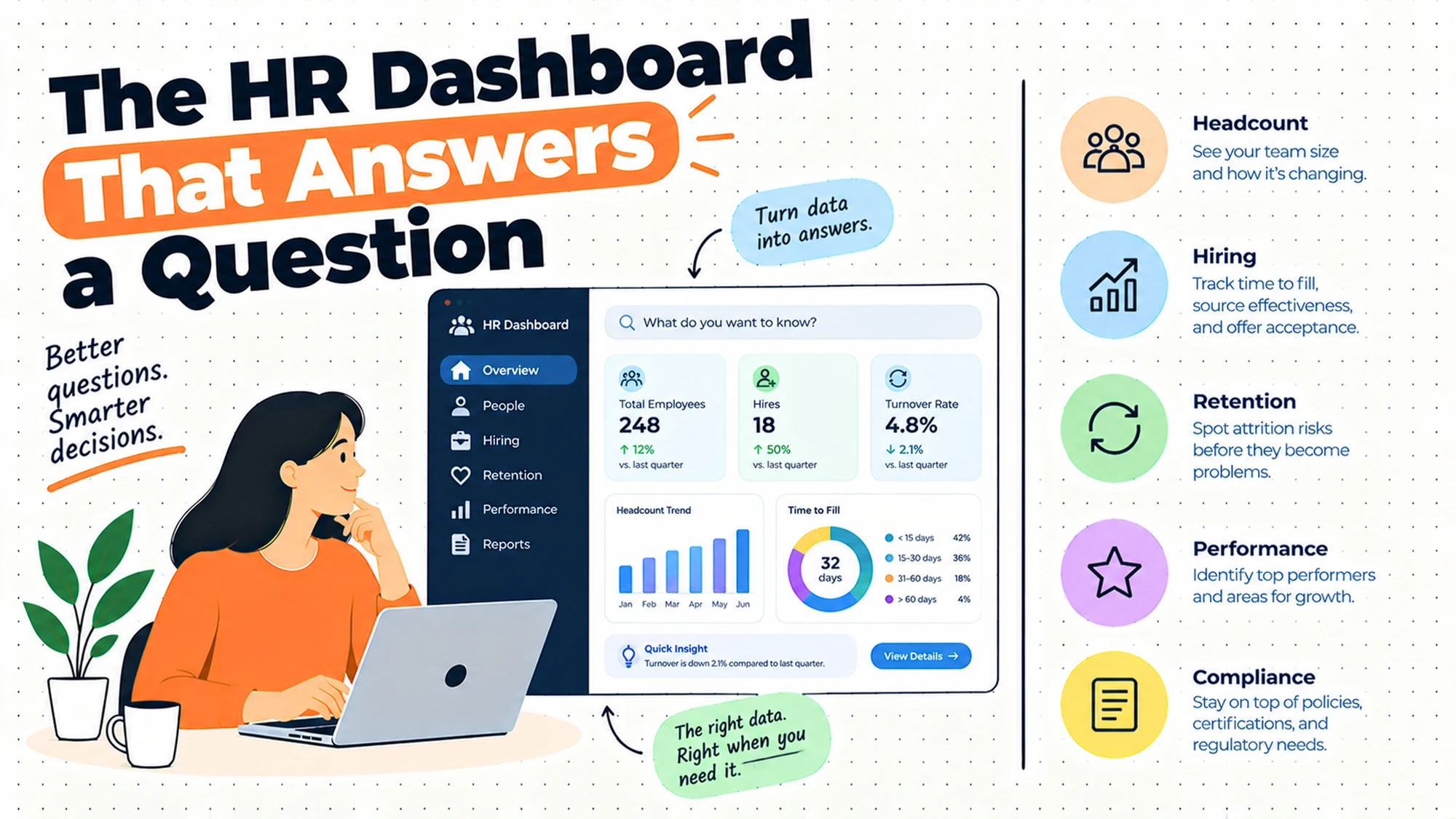
What should go on an HR dashboard? Whatever answers the question that prompted somebody to ask for it, and very little else. The standard failure is to fill the space with everything the system can produce, on the reasoning that more information cannot hurt. It can. Every number nobody asked for competes for attention with the one that matters, and it invites questions that lead somewhere unproductive.
Why do two HR reports disagree? Almost always definitions rather than errors. Headcount can count contracts or people or full-time equivalents. A start date can be the date of acceptance, the contractual date or the first day actually worked. A leaver can be counted on their last working day or their contractual end date. Each choice is defensible and they produce different totals, so two correct reports disagree.
Who should see it? Depends entirely on what it contains, and this needs deciding rather than inheriting. A team-level view for a manager is a different artefact from an organisational view for a leadership group, and combining them produces something too coarse to act on and too detailed to be appropriate. Where the content touches individuals, what you may show and to whom differs by jurisdiction, so establish that locally.
Should we build it in the HR system or a reporting tool? The HR system if you can, because the data is already there and the definitions live in the same place. A separate reporting tool earns its place when you need to combine HR data with something else, typically finance, or when the system's own reporting genuinely can't express the question. The cost of the separate tool is a second place where definitions live, and they will drift.
Nobody opens it. What now? Ask the person it was built for what they actually wanted to know, and be prepared for the answer to be a single number or something the dashboard doesn't show. Dashboards that go unopened are usually built for a general audience that doesn't exist, rather than for the specific person who asked the original question.
Why Two Reports Disagree
This is the part worth doing before any tooling decision. Each of these has at least two defensible answers, and choosing is the work.
| The definitional choice | Two defensible answers | Which decision each one distorts |
|---|---|---|
| What headcount counts | People, or contracts, or full-time equivalents | Capacity planning versus cost planning |
| When somebody starts | Acceptance, contractual date, or first day worked | Time-to-fill and joiner counts by period |
| When somebody leaves | Last day worked, or contractual end date | Leaver counts and any turnover view |
| Who somebody's manager is | The recorded line, or who directs the work | Team size and anything rolled up by manager |
| Whether open roles count | Included as planned, or excluded until filled | Capacity, cost and how big a team looks |
| Which population is in scope | Employees only, or everybody doing the work | Almost every organisational comparison |
The last row causes the most trouble and gets the least attention. An organisation using contractors, agency workers or people engaged in other arrangements has a real question about who belongs in a people number, and the answer genuinely differs by purpose: a cost view wants everybody being paid, a capacity view wants everybody doing work, an employment view wants only employees. All three are legitimate and they cannot share a single figure.
The fourth row produces disagreements that look like errors rather than definitions, which makes them harder to resolve. If the recorded reporting line differs from who actually directs somebody's work, any view rolled up by manager will look wrong to the managers concerned, and they'll report it as a data problem. It is, but the fix is in the record rather than the report.
Five Diagnostic Questions You Can Self-Assess Against
Can two people produce the same number independently? Test it. Ask two people to answer the same question from whatever you have now, without conferring. If they differ, you have a definition problem and a dashboard will make it more official rather than less. If they agree but neither can explain the method, you have a reproducibility problem, which is the same thing with a delay.
What question prompted this? There's always an originating question and it's usually specific. Find it. Dashboards drift from their purpose within weeks of the first build, because each new viewer requests an addition, and eventually nobody can say what the thing is for.
Who is the single person this is for? Not the audience. The person. Views built for a named individual with a known question get used, and views built for a general population get opened once. If you cannot name the person, you're building a report rather than answering a need.
Where are the definitions written? If the answer is that they're implicit in how the report was built, then they exist only in the head of whoever built it and in the configuration nobody reads. The first person to rebuild it will choose differently, and the numbers will change for no visible reason.
What happens when the number looks wrong? There should be a route: somebody to ask, a way to see the underlying records, an explanation of the definition. Without one, the response to an unexpected figure is to distrust the whole view, and that distrust is permanent in a way that a single wrong number is not.
Six Kinds of HR Dashboard, Reviewed
The headcount and movement view
Who's here, who joined, who left, by period and by area. It earns its place as the most requested and most genuinely useful view in this area, because these are the questions that recur and the ones people expect HR to answer instantly.
Where it falls short is entirely definitional. Every element here has multiple defensible meanings, and a view built without those decisions written down will produce numbers that shift when somebody rebuilds it. It's also the view most likely to be compared against finance's version, which counts differently for good reasons.
Build it, and agree the definitions with finance before you do. The meeting is unpleasant and it's the difference between a number people act on and a number people argue about.
One structural choice makes this view considerably more useful and is usually skipped: show movement alongside the total. A headcount figure on its own invites the question of whether it went up or down and why, which somebody then answers from memory. Showing joiners and leavers for the period next to the total answers the obvious follow-up in the same glance, and it exposes the cases where a flat total conceals a great deal of churn underneath.
The operational queue view for the HR team
What's outstanding: open requests, incomplete tasks, things approaching a date. It earns its place because it's the only view here that changes behaviour the same day, and because it serves people who'll open it every morning rather than monthly.
Where it falls short is that it's frequently not built at all, because it isn't strategic and nobody senior asks for it. Teams end up with an attractive organisational view that gets opened monthly and no view of their own work, which is the wrong way round for a function drowning in requests.
This is the most underrated item on the list. Build it first, because the people it serves will tell you immediately when it's wrong, which is how a view gets good.
It has a second benefit that only appears later. A team with a visible queue can describe its own workload in a conversation about resourcing, which is otherwise one of the hardest arguments in this function to make. Saying the team is busy carries no weight; showing what arrived, what was completed and what is ageing carries a great deal, and it is the same view that was built to get through the week.
The manager view of their own team
A manager sees their people, their pending actions, their team's information. It earns its place because it removes a whole class of request from HR and because managers genuinely want it, which is rare enough to be worth acting on.
Where it falls short is access and accuracy at the edges. It depends on the recorded reporting line being right, so wherever the record and reality differ, a manager sees a team that isn't theirs or misses somebody who is. That's the most visible possible way to expose a record problem. There's also a real question about what a manager should see about their own people, which differs by jurisdiction and needs a local answer rather than a default.
Fix the reporting lines first, then release it. A manager view built on a shaky record damages trust in everything else.
Expect the release itself to surface errors, and treat that as a benefit rather than a problem. Managers are the only people who reliably know when their own team is listed wrongly, and giving them the view converts a record nobody was checking into one that several hundred people are checking continuously. Provide an obvious way to report a mistake, because without one they will simply conclude the system is wrong and stop looking.
The board pack rebuilt each period by hand
Somebody assembles a curated view for a governance audience each cycle. It earns its place because that audience needs interpretation rather than data, and because the act of assembling it forces somebody to look at the numbers properly, which is a genuine quality control.
Where it falls short is the recurring cost and the transcription risk. Each rebuild is hours of somebody senior's time, and manual assembly introduces errors that automated views don't have. It also tends to drift in definition between periods, because the person building it makes judgement calls that aren't recorded.
Generate the underlying figures and let the assembly be commentary. Keep the human step for interpretation, not for arithmetic.
The drift between periods is worth guarding against explicitly. Because each rebuild involves judgement, small choices accumulate: a team gets grouped differently, a category gets renamed, a figure that was excluded last time is included now. None of it is wrong and the series stops being comparable, which matters because a governance audience is mostly reading the direction rather than the level. Keeping the generated figures stable protects the comparison even when the commentary changes.
The live self-serve tool for anybody
A flexible view where people can build their own queries. It earns its place in organisations where the questions are genuinely varied and the reporting team has become a bottleneck for requests that are individually small.
Where it falls short is that it distributes the definitional problem to people who don't know it exists. Somebody builds a view, chooses a filter without understanding what it excludes, and presents a number in a meeting. It's wrong in a way nobody can see, and it carries the authority of having come from the system.
If you offer this, ship the definitions alongside it and make the common views pre-built. Self-serve works when the defaults are right and people are mostly choosing a filter, not designing a measure.
It is also worth deciding what happens to a view once somebody builds it. Left alone, useful ones get shared, saved and reused long after the person who built them has forgotten the assumptions behind them, which reproduces the private spreadsheet problem inside the official tool. A light convention, such as naming the owner and the question on anything shared beyond its author, costs almost nothing and makes the assumptions recoverable.
The spreadsheet somebody maintains privately
One person keeps their own view because the official one doesn't answer their question. It earns its place more often than anybody admits: these sheets exist because they're genuinely useful, and they frequently encode knowledge the official reporting doesn't capture.
Where it falls short is that it's invisible and unversioned. Nobody knows it exists, its definitions are in one person's head, and when its numbers appear in a meeting they compete with the official ones. It also stops abruptly when that person leaves.
Don't ban them, because banning drives them underground and they'll still exist. Find them, work out what question each one answers, and either bring that question into the official view or accept the sheet and document its definitions.
Approach the conversation carefully, because the person maintaining one usually expects to be told off. They have generally solved a real problem at their own expense, and treating the sheet as evidence of a gap in the official reporting rather than as a breach of process gets you a far more honest account of what it does and why the existing view was not enough.
The Decision Table
| Situation | Scale | Setup | Primary Pain | Recommended Starting Point |
|---|---|---|---|---|
| Questions are rare, answers undisputed | Under fifty | Any | None | Answer by hand |
| Same question rebuilt every period | Any | Any | Repetition, not tooling | Save the method, write the definition |
| Two people produce different numbers | Any | Any | Definitions, not errors | Agree definitions before building |
| HR team drowning, no view of own work | Any | Growing team | Wrong view built first | Build the operational queue view |
| Managers asking HR for team basics | Over one hundred | Distributed | No served manager view | Fix reporting lines, then release |
| Board pack takes hours to assemble | Any | Governance cycle | Manual arithmetic | Generate figures, keep the commentary |
| Numbers from self-serve appear wrong | Any | Self-serve tool | Definitions distributed unknowingly | Pre-build views, publish definitions |
| Private spreadsheets in circulation | Any | Any | Official view misses a real question | Find them, adopt the question |
| External reporting on a cycle | Any | Regulated or listed | Definition set externally | Follow it, take local advice |
The third row is the one to resolve before spending anything, and it's the row most often skipped because it produces an uncomfortable meeting rather than a deliverable. Getting HR and finance to agree what headcount counts, in writing, for which purpose, is the single highest-value hour available in this area, and no tool substitutes for it.
The fourth row is worth noticing because it reveals a pattern. HR teams reliably build the view somebody senior asked for and not the view they need themselves, and the result is an attractive monthly artefact alongside a team that still tracks its own work in a sheet. The internal view is less impressive and more useful.
What a Dashboard Cannot Do
Being clear about the limits saves a lot of effort spent trying to make a view do something the format can't.
It cannot resolve a definitional disagreement. Displaying a number more prominently doesn't make it more agreed. If two functions count differently, the dashboard becomes a third position rather than a settlement.
It cannot tell you why. Every view here shows what happened, and the question that follows is always why, which requires knowing about a reorganisation, a team that had a bad quarter, a change in how something was recorded. That context lives in people.
It cannot make a number safe to act on. A figure produced by a system carries an authority its underlying data may not deserve. The confidence people place in a dashboard is a function of its presentation, not its accuracy, which is why a clean view built on a weak record is more dangerous than a rough one.
It cannot serve two audiences. A view detailed enough for an HR team to work from is too granular for a leadership meeting, and a view summarised for leadership can't support daily work. Attempting both produces something nobody uses.
It cannot replace the person who noticed. Manual answering has an underrated property: somebody looks at the data each time and spots when something is strange. Automating that away removes the anomaly detection along with the effort, and nothing flags the odd result until it reaches a meeting.
That loss is worth replacing deliberately rather than accepting. The cheapest substitute is somebody scanning the view briefly on a fixed rhythm with permission to ask about anything that looks wrong, which is a few minutes of work and recovers most of what automation removed. Without it, the first person to examine a figure closely is usually somebody in a meeting who has a reason to doubt it.
It cannot create trust it hasn't earned. Trust in a number comes from people having checked it and found it right, which takes time and a route to challenge it. A new dashboard starts with no trust and accumulates it slowly, or loses it permanently the first time somebody finds an error nobody could explain.
This argues for releasing narrowly and early rather than broadly and late. A view shown to a handful of people who will check it properly gets its errors found while the stakes are low, and those people become the ones who vouch for it afterwards. A polished view released to everybody at once has its first error found in public, by somebody with no investment in it, which is the most expensive possible way to discover a definition problem.
Where HR Dashboards Go Wrong
| The failure | How it shows up | What would have to change |
|---|---|---|
| Built to display, not to answer | Many numbers, none acted on | Start from the originating question |
| Definitions never written | Figures shift when somebody rebuilds | Write them down, agree them once |
| One view for every audience | Too coarse to act on, too detailed to read | Separate views per named audience |
| No route to challenge a number | One odd figure discredits everything | Somebody to ask, records to inspect |
| Manager view on unreliable lines | Managers see teams that are not theirs | Fix the record before releasing |
| Self-serve without published definitions | Confidently wrong numbers in meetings | Pre-built views and visible definitions |
The fourth row is the one that determines whether a dashboard survives its first year. An unexpected number is inevitable, and what matters is what happens next. If somebody can ask a person, see the records behind the figure and get an explanation, the view gains credibility from the episode. If there's no route, people conclude the whole thing is unreliable, and that conclusion doesn't reverse.
The second row is the quiet killer. Definitions held only in a report's configuration are definitions nobody can review, so when the report is rebuilt by somebody else, different choices get made and the numbers move. Nobody can explain the movement, which looks exactly like an error, and the trust cost is the same whether or not anything was wrong.
What to Put in Writing
| Artefact | Who owns it | When it is written | What it prevents |
|---|---|---|---|
| The question this view answers | Whoever requested it | Before building | A display that answers nothing |
| The named person it is for | The builder | Before building | A view for a general audience |
| What headcount counts, per purpose | HR with finance | Before building | Two correct numbers disagreeing |
| Start and leaver date definitions | HR | Before building | Joiner and leaver counts that shift |
| Who can see what, at which detail | HR, with local advice | Before release | Disclosure decided by a default |
| The route to challenge a figure | HR | Before release | One odd number discrediting the view |
The third row is worth the meeting it requires. HR and finance count differently for defensible reasons, and the disagreement will surface in the most public setting available unless it's settled privately first. Writing down which definition applies to which purpose takes an hour and removes a recurring argument that has consumed senior time in every organisation that skipped it.
Questions to Ask Before You Commit
On purpose. What question prompted this? A bad answer is visibility.
On audience. Who specifically is it for? A bad answer is the business.
On definitions. Where are they written? A bad answer is in the report.
On agreement. Has finance agreed the count? A bad answer is that they use their own.
On challenge. What happens when a number looks wrong? A bad answer is that it won't.
On scope. Which population is included? A bad answer is everybody.
On movement. Does it show joiners and leavers beside the total? A bad answer is that the total is enough.
What Getting This Wrong Costs
The first cost is the recurring meeting that becomes about arithmetic. Senior people spend time reconciling figures instead of deciding things, and because the reconciliation never addresses the definition, it recurs at the same interval indefinitely. Organisations rarely attribute this cost to a missing decision, because each individual instance looks like a small data issue rather than a structural one.
The second cost is trust, which behaves asymmetrically. It accumulates slowly, through people checking numbers and finding them right, and it disappears quickly when somebody finds a figure nobody can explain. Once a leadership group has decided a dashboard is unreliable, they revert to asking for numbers by hand, and the view continues to exist while nobody uses it.
The third cost is the decision made on a number that counted the wrong population. Most definitional errors are caught because somebody notices the figure looks odd. Occasionally one isn't, a plan gets built on it, and the error surfaces after commitments have been made. That's rare, and it's the reason the boring work of agreeing definitions is worth doing before anybody needs it rather than after.
So before building anything, do three things. Find the question that prompted the request. Ask two people to produce the answer independently and see whether they match. And get the definitions written down and agreed with finance. If those three are done, the dashboard is mostly a formatting exercise. If they aren't, no tool will save it.
When You Are Ready to Go Further
None of this needs a reporting platform. It needs the originating question written down, the person it's for named, the definitions agreed with finance in writing, and a route for somebody to ask why a number looks wrong.
Build the operational view for your own team before the organisational view for somebody senior. It's less impressive and it gets used daily, which means it gets corrected quickly, and a view that's been corrected by its users is the only kind anybody trusts.
Then go looking for the private spreadsheets. Each one exists because the official reporting didn't answer a real question, and the question is more valuable than the sheet. Bringing those questions into the official view is how a dashboard stops being an artefact somebody built and starts being the place people actually look.
HROpsLab publishes independent comparison work across HR tooling, applicant tracking and payroll. We sell nothing, we take no vendor money, and we publish no paid placements. If the next step is looking at what your current tooling actually supports here, our comparison work is one place to start.
Frequently Asked Questions
What should go on an HR dashboard?
Whatever answers the question that prompted somebody to ask for it, and remarkably little else. The standard failure is filling the available space with everything the system can produce, on the assumption that more information cannot hurt, when in fact every unrequested number competes for attention with the one that matters and invites tangents. Start by finding the originating question, name the single person the view is for, and resist additions from each new viewer, because that drift is how dashboards stop having a purpose anybody can state.
Why do two HR reports show different numbers?
Definitions rather than errors, in almost every case. Headcount can count people, contracts or full-time equivalents. A start date can be acceptance, the contractual date or the first day actually worked. A leaver can be counted on their last working day or their contractual end. Each choice is defensible, so two correct reports legitimately disagree. The scope question causes the most trouble: whether contractors and agency workers belong in a people number genuinely depends on whether the number is for cost, capacity or employment, and those cannot share one figure.
How do you define headcount?
Not universally, which is the honest answer, and the useful move is to define it per purpose rather than once. A cost view wants everybody being paid. A capacity view wants everybody doing the work, which may include people who aren't employees. An employment view wants employees only. Write down which definition applies to which purpose, agree it with finance before building anything, and store the underlying facts so each view can apply its own rule rather than storing somebody's interpretation as though it were a fact.
Who should have access to an HR dashboard?
It depends entirely on what it contains, and this needs a deliberate decision rather than an inherited default. A manager's view of their own team is a different artefact from an organisational view for a leadership group, and merging them produces something too coarse to act on and too detailed to be appropriate. Where the content touches identifiable individuals, what may be shown and to whom differs by jurisdiction and by the kind of data involved, so establish the position locally with proper advice before release rather than afterwards.
Should you build an HR dashboard in the HR system or a separate tool?
Prefer the HR system where it can express the question, because the data is already there and the definitions live in the same place as the records. A separate reporting tool earns its place when you genuinely need to combine HR data with something else, usually finance, or when the system's own reporting cannot answer the question at all. The cost of the separate tool is a second location where definitions live, and definitions in two places drift apart without anybody deciding that they should.
Why does nobody open our HR dashboard?
Usually because it was built for a general audience that doesn't exist, rather than for the specific person who asked the original question. Ask that person what they actually wanted to know and be ready for the answer to be a single number, or something the dashboard doesn't show at all. The other common cause is a lost trust event: somebody found a figure nobody could explain, concluded the view was unreliable, and went back to asking for numbers by hand. That conclusion rarely reverses on its own.
How do you stop people building their own spreadsheets?
You mostly don't, and trying tends to drive them underground while they continue to exist. Those sheets are built because the official reporting doesn't answer a real question, which makes the question more valuable than the sheet. Go and find them, work out what each one is for, and either bring that question into the official view or accept the sheet and document its definitions so the numbers can be reconciled when they appear in a meeting. The risk isn't their existence, it's that nobody knows their definitions.
How often should an HR dashboard be refreshed?
Match it to the decision it supports rather than to what's technically possible. An operational view for the HR team needs to be current, because the actions it prompts happen the same day. A headcount view supporting a monthly conversation gains nothing from being live and loses something, since a figure that moves between when somebody reads it and when they quote it creates exactly the confusion the view was built to prevent. For anything reported externally on a cycle, the definition and the timing are usually set for you.
Fewer numbers, defined once, that people can challenge. That's the whole of it.
Everything else in this area is formatting.