
TL;DR
- The core decision: whether you maintain the picture or maintain the data, because only one of those stays right.
- When doing nothing is right: when everybody can name who they report to and nobody outside the team needs the answer.
- What has to be true: the reporting relationship is recorded somewhere, and somebody is obliged to change it when it changes.
- How the options split: by whether the chart is drawn or generated, which determines how fast it decays.
- Decision rule: if updating the chart is a separate task from making the change, it will be out of date.
- Outcome to expect: a chart that's right because nobody maintains it, only the data behind it.
Three Charts, Three Answers
Somebody asks for a current org chart. It's a reasonable request and it turns out to be surprisingly hard.
There's a version in a slide deck from the last board meeting, which was accurate in the week it was made. There's a drawing somebody in operations keeps, which is more current but excludes two teams they don't work with. And there's whatever the HR system generates, which is technically live and shows four people reporting to somebody who left in the spring, because the record was never updated and nobody noticed since the leaver process closed their access rather than reassigning their reports.
All three are wrong in different directions. Reconciling them takes a morning. And a fortnight later, all three are wrong again.
Best tools for HRIS Software
What makes this frustrating is that it feels like a tooling problem, so the usual response is to find better charting software. That almost never helps, because the chart is not the thing that's broken. A chart is a rendering of reporting relationships held somewhere else, and it is wrong whenever the underlying data is wrong or the relationship itself is a fiction.
Most organisations maintain the picture rather than the data, which guarantees drift. Somebody redraws a box, the drawing is now right and the record is still wrong, and the next person to generate a chart from the record produces something that contradicts the drawing.
So the useful reframe is that the chart is an output, and the durable fix is deciding where the reporting relationship is recorded and who is obliged to change it when somebody moves. Everything else is drawing.
When You Genuinely Do Not Need to Act Yet
Your current setup is genuinely fine. Everybody can name who they report to, the answer is the same if you ask two people, and nobody outside the team needs the structure written down. At a certain size an org chart is documentation of something everybody can see, and maintaining it is work with no reader.
Friction is starting to show. Somebody asked for a chart and you couldn't produce one quickly, a new joiner couldn't work out who to approach, or two versions disagreed. These are cheap to address and they usually point at a recording question rather than a charting one.
It has become a real cost. Approvals route to the wrong person, a restructure is being planned from a picture nobody trusts, or leavers stay visible in the structure for weeks. At this point the inaccuracy has consequences beyond tidiness, and the fix is about where the data lives rather than what draws it.
The edge case that forces it. You're going through a restructure, a merger, or a period where the structure is genuinely in flux and several people need a shared view of a moving target. Or you have an obligation to evidence reporting relationships for some purpose. What must be evidenced and retained differs by jurisdiction and by sector, so establish what applies where you operate before building anything around it.
Five Questions This Reader Asks at 11pm
Where should the org chart actually come from? From wherever the reporting relationship is recorded as part of employment, which in most organisations means the core HR record. That's the only place where the relationship gets changed as a consequence of something that had to happen anyway, which is what keeps it current. Any chart maintained as a separate artefact will drift, because updating it is an extra task competing with everything else.
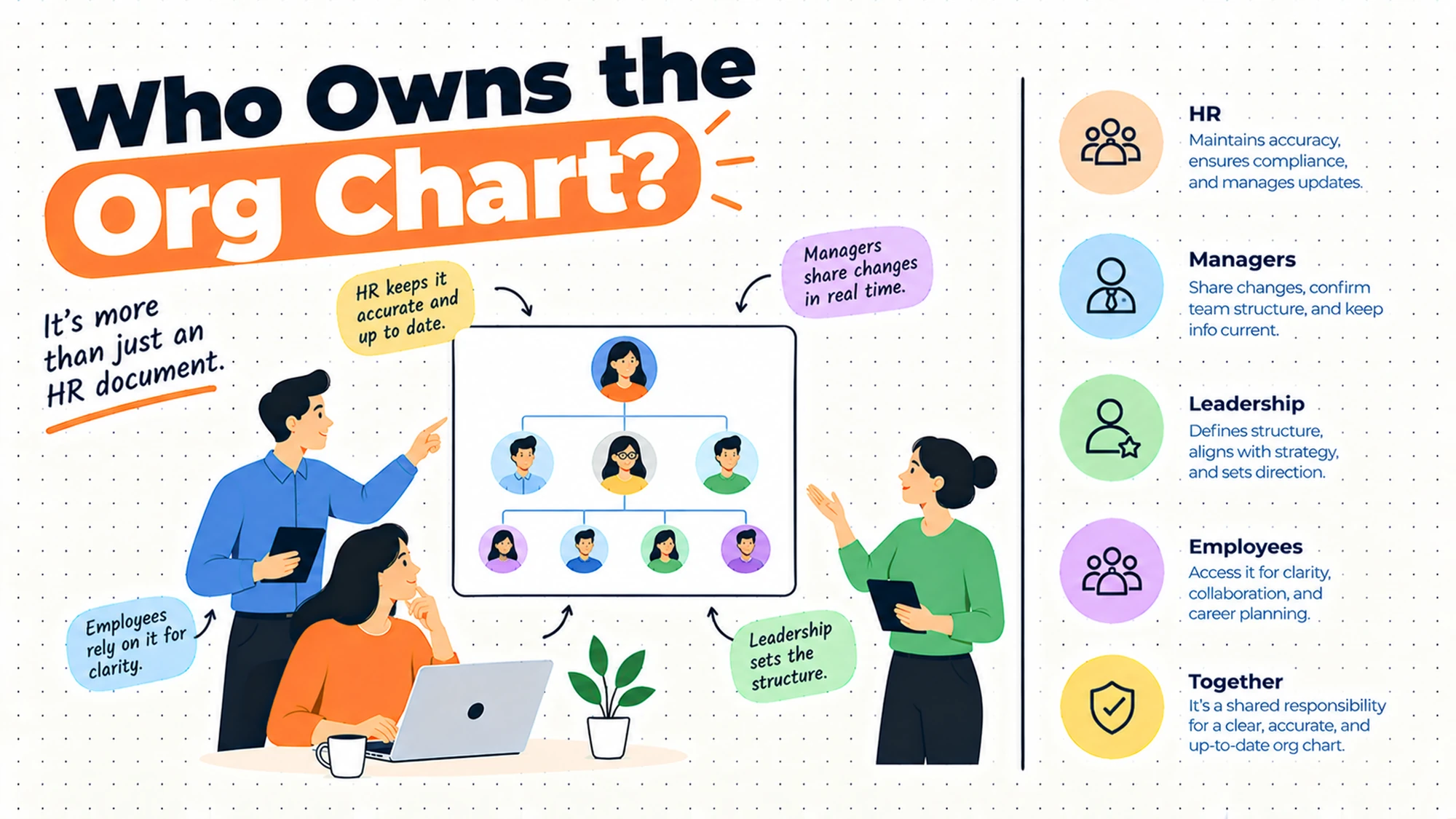
Who should own it? Two different owners for two different things, and conflating them is the usual mistake. Somebody owns the data, meaning they're accountable for reporting lines being correct in the record. Somebody else may own the presentation, meaning how it's displayed and for whom. The data ownership is the one that matters, and it belongs with whoever processes position changes rather than with whoever makes the slides.
Why is it always out of date? Because the change and the chart update are separate actions. Somebody gets promoted, the promotion happens, and updating the structure is a second task somebody has to remember. Anything that depends on remembering will fail at a predictable rate. The fix isn't more diligence, it's making the chart a consequence of the change rather than a task after it.
How do we show dotted lines? Carefully, and less often than people want to. A dotted line usually means one of several different things: an advisory relationship, a functional relationship alongside a management one, or a compromise nobody wanted to resolve. Drawing it makes the ambiguity look official. Sometimes that's honest and useful; frequently it's a way of avoiding a conversation about who actually decides.
Do we need dedicated charting software? Usually not, and it's worth checking what your existing systems already produce before buying. The cases where a separate tool earns its place are specific: modelling a restructure without touching live data, showing a structure that doesn't match employment reporting, or presenting to an audience where the generated view is too raw. Those are real, and they're narrower than the market suggests.
Why the Chart and the Reality Disagree
Drift has a small number of consistent causes, and each has a different fix. Knowing which one you have is most of the work.
| Cause | How it shows up | What would have to change |
|---|---|---|
| Chart drawn separately from the record | Two versions, both defensible | Generate from the record, stop drawing |
| Change happens, update is a second task | Weeks of lag after every move | Make the update part of the change |
| Leaver closed but reports not reassigned | People reporting to somebody who left | Reassignment as part of the leaver process |
| Vacancies not represented | A team appears smaller than it is | Decide whether open roles appear |
| Interim arrangements never formalised | Somebody acting up for a year, unrecorded | Record the interim with an end date |
| The line on paper is not the real one | The chart says one thing, work says another | Fix the arrangement, not the drawing |
The third row is the most common single cause of a chart being obviously wrong, and it happens because the leaver process is designed around access rather than structure. Closing an account is urgent and visible. Reassigning the people who reported to that person is neither, so it waits until somebody notices the chart looks strange, which can be months.
The last row is the one that cannot be fixed by any system. If the recorded line says somebody reports to a manager and the actual work is directed by somebody else, the chart is accurately recording a fiction. That's an organisational problem wearing a data problem's clothes, and redrawing the box changes nothing.
Five Diagnostic Questions You Can Self-Assess Against
Is your chart drawn or generated? If somebody moves boxes by hand, you have a picture that will be wrong shortly. If it renders from a record, you have a chart that's exactly as right as the record. That distinction predicts almost everything else about how much effort this will cost you.
When somebody is promoted, how many places record it? Trace one. If the answer is more than one, the versions will diverge, and the divergence will be discovered by somebody trying to route an approval. One place, with everything else reading from it, is the only arrangement that holds.
What happens to a leaver's reports? Ask what the process says, then check a real recent case. This is where structure rots fastest and where the rot is most visible to everybody else.
Can somebody two levels away work out who to ask? That's the main daily use of a chart and it's rarely the thing anybody designs for. If a new joiner can't find the person who owns a process from the structure, the chart is serving an audit purpose rather than a working one.
Does the chart show what you'd want an outsider to see? Structure is sensitive in ways people underestimate: vacancies signal intent, small teams signal priority, a manager with one report signals something. Before making a chart broadly visible, decide what it reveals. Obligations around what personal information may be displayed and to whom differ by jurisdiction, so check locally rather than assuming.
Six Ways Organisations Maintain an Org Chart, Reviewed
A slide deck updated for board meetings
Somebody rebuilds the structure in a presentation each time it's needed. It earns its place because a board audience wants a curated view: the level of detail they care about, annotated, with the parts relevant to the conversation emphasised. A generated chart is frequently too raw for that.
Where it falls short is everything outside the meeting. The deck is accurate on the day it's made and immediately begins drifting, and because it looks authoritative it gets reused, forwarded, and treated as current months later. Rebuilding it each cycle also consumes real time from somebody senior enough to know the structure.
Keep the deck as a presentation artefact and generate the underlying structure from the record. Then the rebuild becomes editing rather than reconstruction.
One habit makes the deck much less dangerous for very little effort: put the date the structure was taken on the slide itself, prominently rather than in a footer. A chart circulating without a date is assumed current by everybody who receives it, and the assumption survives for months. A dated one is self-limiting, and people who need something newer will ask instead of acting on it.
A drawing tool owned by one person
Someone maintains the structure in a diagramming tool because they got asked once and never stopped. It earns its place on flexibility: you can draw anything, including the arrangements a system refuses to model, and the result looks exactly as intended.
Where it falls short is the single owner and the separate update. The chart is as current as that person's attention, it stops when they're away or leave, and nobody else knows how to change it. It also has no connection to the record, so the two diverge continuously and neither is definitively right.
This is the most common arrangement in mid-sized organisations and the one most worth replacing. If you keep it, at least make it read from the record rather than from memory.
There is also a continuity problem worth naming plainly, because it is usually discovered at the worst moment. The person maintaining the drawing holds a great deal of undocumented knowledge about why the structure looks the way it does: which arrangements are temporary, which lines were compromises, which boxes are deliberately vague. None of that is in the file. When they leave, the next person inherits a diagram they cannot safely change.
A generated view from the core employee record
The chart renders from reporting lines held in the HR system. It earns its place because the update is a consequence of a change that had to happen anyway. Somebody's position changes in the record because that's how they get paid correctly, and the chart follows without anybody maintaining it.
Where it falls short is that it shows exactly what the record says, including the gaps. Missing reassignments, unrecorded interim arrangements and vacancies handled inconsistently all appear as visible oddities. That's uncomfortable and it's the system working: the chart has become a monitor for record quality.
This is the right default. Expect the first generated chart to be embarrassing, and treat that as the list of record problems to fix rather than a reason to go back to drawing.
Share that first version narrowly while you work through it. The temptation is either to hide it until it is perfect, which means the fixes never get prioritised, or to publish it immediately, which teaches everybody the generated chart is unreliable and sends them back to the drawing. A small group, a fortnight of corrections, then publication is the sequence that holds.
A separate planning tool for restructures
A tool for modelling changes without touching live data. It earns its place for a genuine need: planning a reorganisation requires moving people around hypothetically, comparing options, and keeping it confidential until decided. Doing that in the live record is not an option.
Where it falls short is the return path. Scenario tools are good at producing a plan and frequently poor at applying it, so the agreed structure gets implemented by somebody manually entering changes into the record, which reintroduces every error you were avoiding. They also encourage planning at a level of abstraction that ignores real constraints.
Use one when you're genuinely restructuring, and plan the path back into the record before you start, not after the decision.
Confidentiality deserves specific thought here rather than being assumed. Restructure planning involves information about identified people and possible outcomes for them, which is a more sensitive category than an ordinary org chart, and what you may hold, who may see it and how long it may be kept differ by jurisdiction. Establish the position locally before the planning starts, because retrofitting confidentiality onto a file that has already circulated is not possible.
A directory that infers structure from teams
Structure derived from group membership or team assignment rather than from explicit reporting lines. It earns its place for the most common daily use, which is finding who does what. For that purpose, team membership is frequently more useful than a reporting line.
Where it falls short is that inferred structure is not reporting structure. Team membership tells you where somebody sits, not who makes decisions about them, and those differ more often than people expect, particularly in matrixed arrangements. Using it for approvals or for anything consequential produces routing errors that are hard to diagnose.
Good for orientation, unsuitable for anything that has to be correct. Keep the two separate rather than letting one quietly stand in for the other.
The drift here is usually silent, which is what makes it worth watching. Nobody decides to use team membership for approvals; a system simply offers it as the available structure, somebody configures a route against it, and it works for most cases. The exceptions are the people whose team and reporting line differ, which is a small group that tends to include the ones in unusual arrangements and therefore the ones whose requests most need attention.
No chart at all
The structure exists in people's heads and nobody writes it down. It earns its place at small scale, where everybody can see the whole organisation and a chart would document the obvious.
Where it falls short is when growth happens without anybody noticing the threshold has been crossed. The signals are consistent: new joiners taking weeks to work out who owns what, approvals going to the wrong person, somebody senior asking a structural question nobody can answer. By then it has usually been a problem for a while.
The transition doesn't need software. It needs the reporting line recorded as part of the employee record, at which point you have a chart whether or not you draw one.
The threshold is easier to spot in hindsight than at the time, so it is worth naming a trigger in advance. A reasonable one is the first time somebody has to ask a third person who owns something. That indicates the structure has stopped being visible from any single vantage point, which is the condition a chart exists to fix, and it usually arrives well before anybody thinks to draw one.
The Decision Table
| Situation | Scale | Setup | Primary Pain | Recommended Starting Point |
|---|---|---|---|---|
| Everybody can see the whole organisation | Under thirty | Single location | None | Do not build a chart |
| New joiners cannot work out who owns what | Any | Any | Orientation, not audit | A generated view, kept simple |
| Two versions disagree | Any | Drawn separately | Maintaining pictures | Generate from the record |
| Weeks of lag after every move | Any | Any | Update is a separate task | Make it a consequence of the change |
| People reporting to a leaver | Any | Any | Leaver process covers access only | Reassignment inside that process |
| Approvals routing wrongly | Any | Matrixed or inferred | Structure inferred from teams | Record explicit reporting lines |
| Planning a restructure | Over two hundred | Any | Cannot model in live data | A scenario tool, with a return path |
| Board wants a curated view | Any | Any | Generated view too raw | Presentation layer over real data |
| Chart to be widely visible | Any | Any | Reveals more than intended | Decide disclosure, take local advice |
The fourth row is the one to fix before any of the others, because it's the root of most of them. If updating the chart is a task somebody performs after making a change, it will lag by however long people take to remember, which is longer than anybody estimates. Making the chart a rendering of the record converts the update from a task into a side effect.
The sixth row is worth catching early because the failures are quiet. When structure is inferred from team membership, approvals route to whoever the system thinks is in charge, which can be nobody in particular. The errors don't announce themselves; they show up as requests that sat somewhere unexpected for a week.
Dotted Lines and Other Fictions
Every org chart eventually meets a relationship it cannot represent honestly, and how an organisation handles that says more about it than the chart does.
The dotted line is the usual response, and it covers several quite different situations. Sometimes it means a genuine functional relationship alongside a management one: somebody managed locally but professionally accountable to a central function. That's a real arrangement, common in organisations with distributed teams, and it deserves representation.
Sometimes it means an advisory relationship with no authority attached, which is worth showing only if people actually consult it. And sometimes it means that two managers both wanted somebody and nobody resolved it, so the ambiguity got drawn instead of settled. That last case is where charts do harm, because rendering an unresolved situation in a formal diagram makes it look like a decision.
The useful test is to ask what the line entitles somebody to. Can they set priorities? Approve leave? Contribute to how the person's work is assessed? If nobody can answer, the relationship isn't defined well enough to draw, and drawing it will not define it.
Three other fictions appear regularly. The manager with one direct report, which is usually a title arrangement rather than a management one. The person shown reporting to somebody two levels up, which is either genuine and worth understanding or a status accommodation. And the vacancy drawn as a box, which signals intent and commitment that may not exist, particularly when the role has been open for a long time and nobody is actively hiring.
A fourth is worth adding because it causes real confusion in growing organisations: the box that represents a role rather than a person, drawn identically to the boxes that represent people. Readers assume every box is somebody, so a structure showing planned shape gets read as current headcount, and the gap between the two only becomes apparent when somebody tries to contact one of them.
None of these needs to be hidden. They need to be decided before they're drawn, because a chart is read as a statement of how things work, and readers do not distinguish between the parts somebody thought about and the parts that were drawn because the tool required a box.
One practical note on matrixed structures. Charts handle single reporting lines well and multiple relationships badly, which is a limitation of the format rather than of any product. Where the reality is genuinely matrixed, a chart plus a short written description of what each relationship covers communicates far more than a diagram with several line styles, which readers cannot decode without a legend they will not read.
Where Org Charts Go Wrong
| The failure | How it shows up | What would have to change |
|---|---|---|
| Maintaining the picture, not the data | Every version disagrees with every other | Generate; stop drawing |
| Update is an extra task | Predictable lag after every change | Make it a side effect of the change |
| Leaver access closed, reports orphaned | Boxes under somebody who left | Reassignment inside the leaver process |
| Ambiguity drawn instead of resolved | Dotted lines nobody can explain | Decide what the line entitles somebody to |
| Structure inferred from team membership | Approvals routed to nobody in particular | Record explicit reporting lines |
| Chart published without deciding disclosure | Reveals intent, gaps and priorities | Decide the audience, take local advice |
The last row catches organisations that treat the chart as neutral information. It isn't. A structure shows where vacancies are, which teams are small, who has been given reports and who hasn't, and where a function reports into. All of that is readable by anybody who receives it, including people you might not have intended, and it's worth a moment's thought before making it broadly available.
The fourth row is the one that produces the longest-running confusion. A dotted line drawn to avoid a conversation does not remove the need for the conversation; it just means the conversation happens repeatedly, in the specific moments when somebody needs to know who decides, and nobody has an answer to point at.
What to Put in Writing
| Artefact | Who owns it | When it is written | What it prevents |
|---|---|---|---|
| Where the reporting line is recorded | Whoever owns the systems | Before drawing anything | Several versions, none authoritative |
| Who changes it, and as part of what | HR | Before the next change | Lag that depends on somebody remembering |
| What happens to reports when somebody leaves | HR, with the leaver process | Before the next leaver | Orphaned boxes under a departed manager |
| Whether vacancies appear, and how | HR with the hiring owner | Before publishing | A chart that signals unintended commitments |
| What a dotted line entitles somebody to | Whoever owns the arrangement | Before it is drawn | Ambiguity rendered as a decision |
| Who can see the chart, and at what detail | HR, with local advice | Before it is shared | Disclosure nobody considered |
The second row is the whole argument of this piece in one line. If changing the reporting line is part of processing a position change, the chart stays current for free. If it's a separate task assigned to somebody, it will lag, and the length of the lag is a measure of how busy that person is rather than anything about the tooling.
Questions to Ask Before You Commit
On source. Where is the reporting line recorded? A bad answer is the chart.
On change. Is updating it part of the change or after it? A bad answer is after.
On leavers. What happens to their reports? A bad answer is that it gets noticed.
On lines. What does a dotted line entitle somebody to? A bad answer is influence.
On vacancies. Do open roles appear? A bad answer is that it varies.
On audience. Who sees this, at what detail? A bad answer is everybody.
What Getting This Wrong Costs
The first cost is routing, and it's the one with daily friction attached. Approvals, requests and escalations follow the recorded structure, so when the structure is wrong they go to somebody who left, somebody who moved, or nobody in particular. Each instance is small and each one costs somebody a day of waiting before they work out what happened and chase it manually.
The second cost lands on new people and is invisible to everybody else. Somebody who has just joined uses the structure to work out who owns what, and a wrong or missing chart means they spend their first weeks asking people who don't know, or making assumptions that turn out to be wrong. They rarely report this, because being unable to find who to ask feels like something they should have worked out.
The third cost is planning on a picture nobody trusts. A restructure designed from a chart that's weeks out of date starts from a false position, and the corrections happen during implementation when they're expensive and visible. This is also the moment when the accumulated drift becomes everybody's problem at once, which is why restructures so often begin with a fortnight of establishing what the current structure actually is.
So before buying anything, answer three questions. Where is the reporting relationship recorded, is updating it part of making the change or a separate task, and what happens to somebody's reports when they leave. Those three determine whether your chart is right. The drawing tool determines only how it looks.
When You Are Ready to Go Further
None of this needs charting software. It needs the reporting line recorded in the employee record, changed as part of processing a position change rather than afterwards, and a leaver process that reassigns reports rather than only closing access.
Generate a chart from that and look at it honestly. The first one will show things you didn't expect: a manager with one report, somebody still reporting to a leaver, a team that looks smaller than it is because two vacancies aren't represented. That list is the value, because it's a record-quality audit you didn't have to run.
The step after that, if the presentation genuinely isn't good enough for the audience that needs it, is a layer over real data rather than a separate drawing. The test for any tool you consider is simple: does it read from the record, and does using it create a second place where structure lives. If it creates a second place, you've bought the problem you were trying to solve.
HROpsLab publishes independent comparison work across HR tooling, applicant tracking and payroll. We sell nothing, we take no vendor money, and we publish no paid placements. If the next step is looking at what your current tooling actually supports here, our comparison work is one place to start.
Frequently Asked Questions
Where should org chart data come from?
From wherever the reporting relationship is recorded as part of employment, which in most organisations is the core HR record. That's the only place the relationship changes as a consequence of something that had to happen anyway, such as processing a position change so somebody is paid and managed correctly. Any chart maintained as a separate artefact requires a second action by somebody who has to remember, and anything depending on remembering fails at a predictable rate. The chart should be an output, not a thing you maintain.
Who should own the org chart?
Two owners for two different things, and conflating them causes most of the confusion. One person owns the data, meaning they're accountable for reporting lines being correct in the record, and that belongs with whoever processes position changes. Somebody else may own the presentation, meaning how the structure is displayed and to whom. The data ownership is the one that determines accuracy. Presentation ownership determines only whether it looks right, and a beautiful chart built on a stale record is worse than a plain one built on a current record.
Why is the org chart always out of date?
Because the change and the chart update are separate actions. Somebody moves, the move happens because it has to, and updating the structure is a second task competing with everything else on somebody's list. The other big contributor is the leaver process, which is usually designed around closing access rather than around structure, so a departing manager's reports sit orphaned until somebody notices the chart looks odd. The fix in both cases is to make the structural update a consequence of the process rather than a follow-up to it.
Do you need dedicated org chart software?
Usually not, and it's worth checking what your existing systems already produce first. Three cases genuinely justify a separate tool: modelling a restructure without touching live data, representing a structure that deliberately differs from employment reporting lines, and presenting to an audience for whom the generated view is too raw. The test to apply to any tool is whether it reads from the record or creates a second place where structure lives. If it creates a second place, you've bought the problem you were trying to solve.
How should you show dotted line reporting?
Sparingly, and only after deciding what the line actually entitles somebody to. Ask whether that person can set priorities, approve absence, or contribute to how the work is assessed. If nobody can answer, the relationship isn't defined well enough to draw, and drawing it makes an unresolved situation look like a decision. Where the structure is genuinely matrixed, a simple chart plus a short written description of what each relationship covers communicates far more than a diagram with multiple line styles that readers cannot decode.
Should vacancies appear on the org chart?
Decide deliberately, because either choice communicates something. Showing open roles signals intent and commitment, which may not be accurate if a role has been open a long time with nobody actively hiring, and it makes teams look larger than their current capacity. Hiding them makes teams look smaller than planned and can misrepresent workload. The practical approach is to show vacancies only where recruitment is genuinely active, mark them clearly as open, and apply the same rule everywhere rather than leaving it to whoever builds the chart.
How often should an org chart be updated?
The question indicates the wrong architecture. A chart that needs updating on a schedule is a drawing, and it will be wrong between updates by a margin nobody can estimate. A chart generated from the record is current whenever it's opened, and the real question becomes how quickly reporting line changes reach the record, which should be as part of processing the change itself. If you're maintaining a picture on a cycle, the improvement available is structural rather than a matter of choosing a better interval.
What do you do when two charts disagree?
Don't reconcile them, because reconciling produces a third version that starts drifting immediately. Establish which source holds the authoritative reporting relationship, fix that record, and generate from it. Then retire the other versions rather than leaving them available, since a chart that exists will be used regardless of what anybody was told about it. Expect the newly generated version to look wrong in places; those places are usually record problems that the drawn charts were quietly correcting by hand, and they're worth fixing at the source.
The chart is an output. Maintain the data and the picture takes care of itself.